Happiness is a new kitchen
This is the first of three posts on our recent kitchen renovation. You can also read the lessons learned from our kitchen renovation and the favorite storage features of my new kitchen. This kitchen renovation has very successful for us and I wanted to share!
After only 24 years of living with an 80s-era kitchen in our 1908 home, my husband and I had our kitchen remodeled this spring. It wasn’t strictly necessary. (In fact, this Huffington Post piece on not needing a new kitchen really resonated with me.) But it seemed time. And, of course, once it was done we wondered why we waited. We absolutely love it.
I thought I’d turn the experience into three blog posts:
- A showy-offy post with before and after pictures (that’s this one)
- A post on lessons learned in the process and my advice to others going through the same thing
- A post showcasing my favorite storage solutions in the new kitchen.
So if you like kitchen renovation posts, keep your eye on the blog for the next week.
I’ll start with some before and after pictures and follow up with a few details about the renovation. (The before pictures were taken right before demo began…the counters were never that clear ordinarily.)
Here we go. From the entrance to the kitchen from the living space:
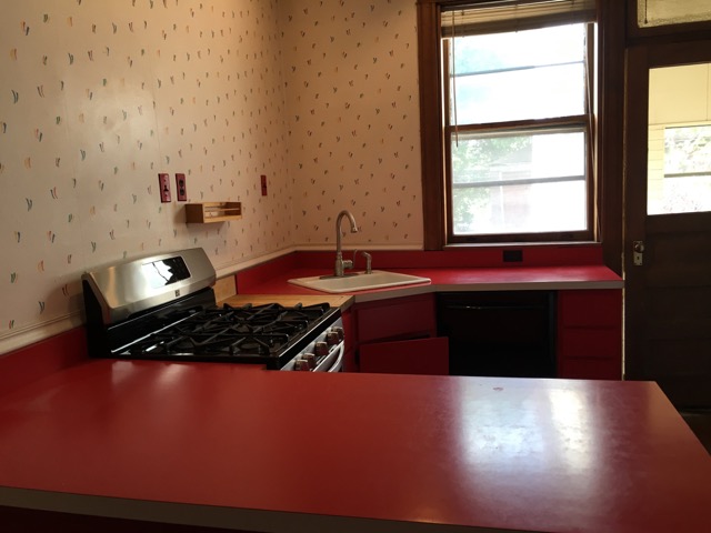
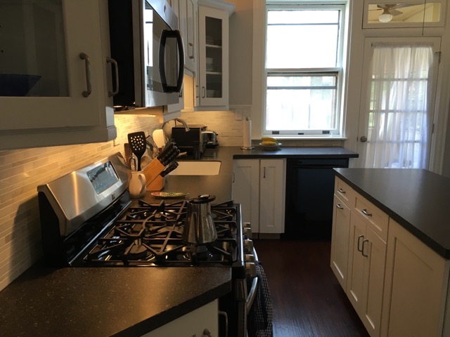
From the sink:
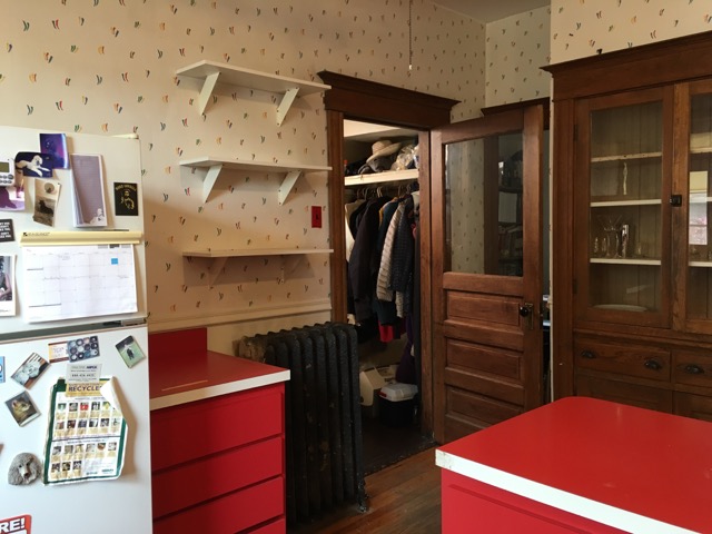
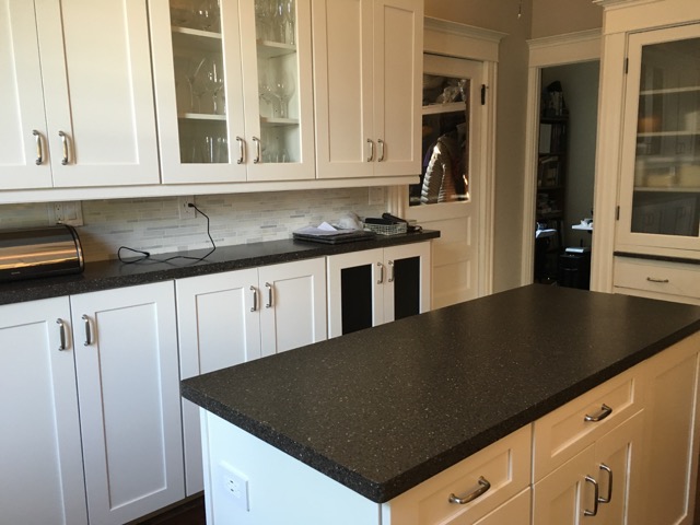
From the back door:
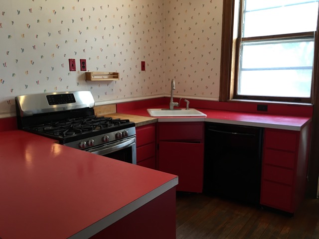
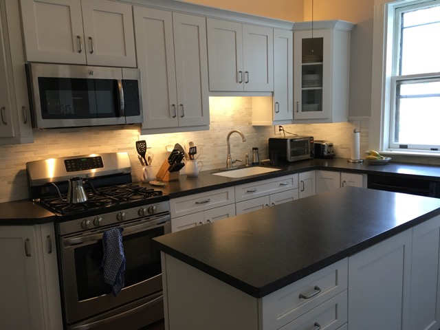
View of the built-in cabinet:
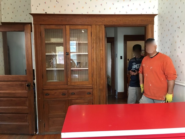
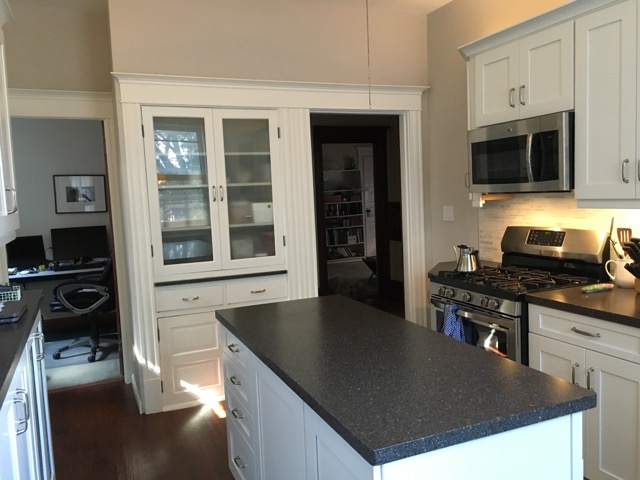
This last “after” shot shows that we sacrificed our pantry so that we could get the refrigerator out of the way. That was a stroke of genius on the part of the designer.
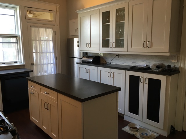
Nice change, huh? The kitchen is not only a lot more attractive, it’s a lot more functional since our storage space expanded many fold, despite our losing our pantry.
We used Home Depot to do this kitchen. The designer, Chris Burns, was exceedingly talented and such a joy to work with. The cabinets are American Woodmark Reading collection. The countertop is LG HI-MACS solid surface, with an integrated sink. We used Allure Ultra vinyl plank flooring. The backsplash is MS International Grecian White Interlocking. We kept our relatively new range and dishwasher but got a new stainless steel refrigerator (Whirlpool) and above-the-range microwave (GE), both purchased at Home Depot.
A big design challenge for Chris was the fact that this 10 × 13 kitchen has five doors in it, plus a built-in cabinet. (The pantry door was replaced by the refrigerator.) It also has a functioning radiator. The whole wall that used to house the refrigerator was designed around the radiator, which is now enclosed by cabinet doors with radiator grill in place of glass. (See the second and fifth after photos.)
We put upper cabinets above and below on the radiator wall. The bottom cabinets had to elevated a little to accommodate the radiator, which means there’s little vertical space on the counter between the cabinets. We only have room for a bread box and a place to stash our keys, which is just fine with me. The contents of the former pantry are now split between the cabinets on the radiator wall (which we call the bar) and the built-in cabinet.
Obviously, we painted all the woodwork white, which felt like a big deal but is such an amazing change. And we replaced the glass of our beloved built-in cabinet with frosted glass.
Getting rid of the peninsula and adding an island was a dream come true. This kitchen is now so functional and so easy to use, not to mention beautiful. It’s gone from a room we tolerated to one we love. It took some time, money and inconvenience, but it was worth every bit!
Tagged with: kitchen, kitchen organization, kitchen renovation 2016
Comments
Thanks so much, Peggy! It’s great to hear from you.
Janine Adams September 15, 2016 12:29 PM
I love how you kept the built in cupboard and painted it to match. What a beautiful, functional kitchen you now have. I too have lived with red benches so know how great it feels not to have them now. We are in the process of painting all the dark woodwork in our house white, it makes such a difference, everything seems clean and bright now.
And September 15, 2016 10:05 PM
definetly looking good and comfortable
its kinda inspiring too
parquet bali July 19, 2017 08:25 PM
Links
- NAPO St. Louis
- Getting to Good Enough podcast
- Shannon Wilkinson, life coach
- Peace of Mind Budgeting
- Organize Your Family History
- Institute for Challenging Disorganization
- Are you interested in becoming a professional organizer?
- Ravelry
- National Association of Productivity and Organizing Professionals


Really nice change and looks very functional
peggy sharp September 15, 2016 11:36 AM